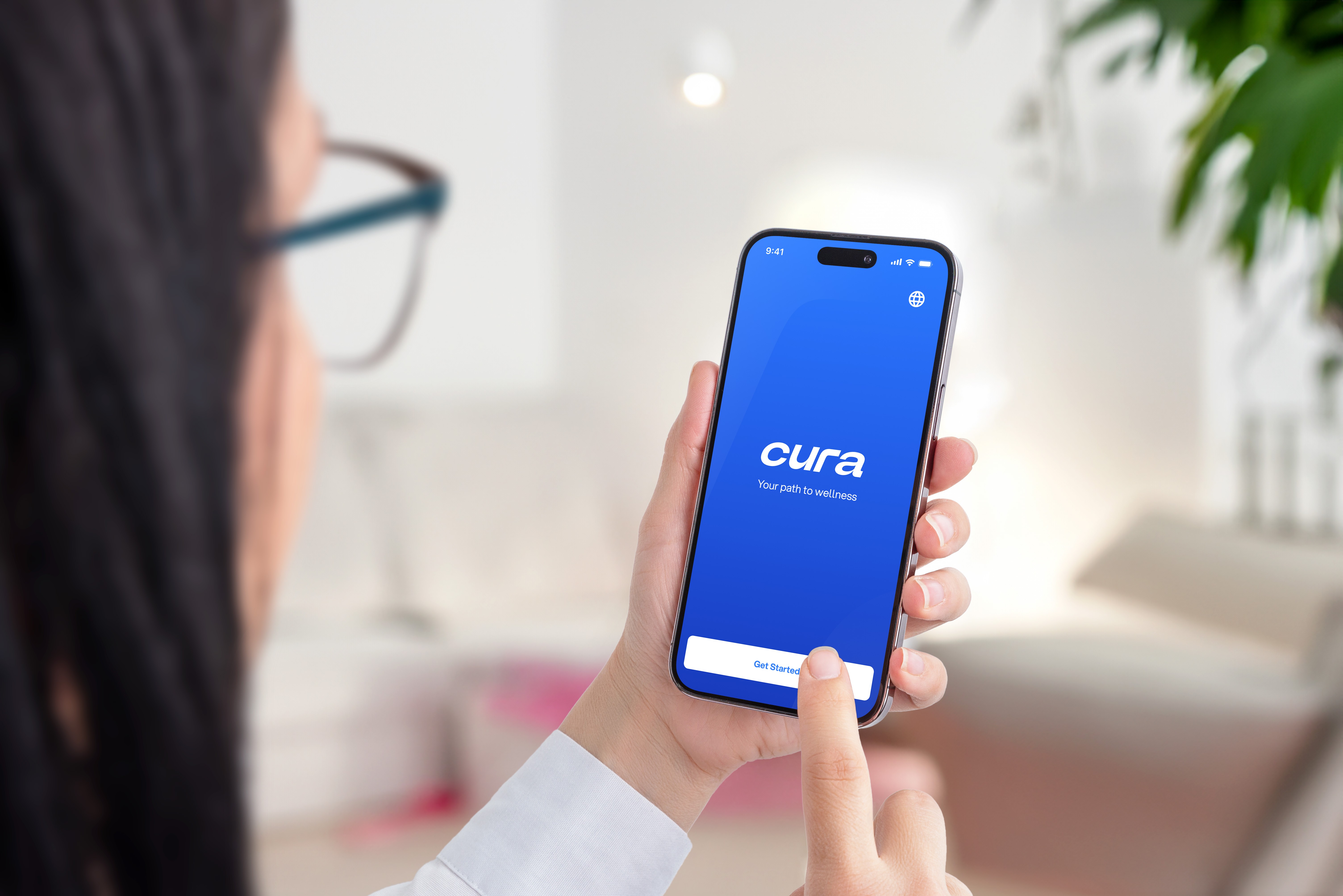
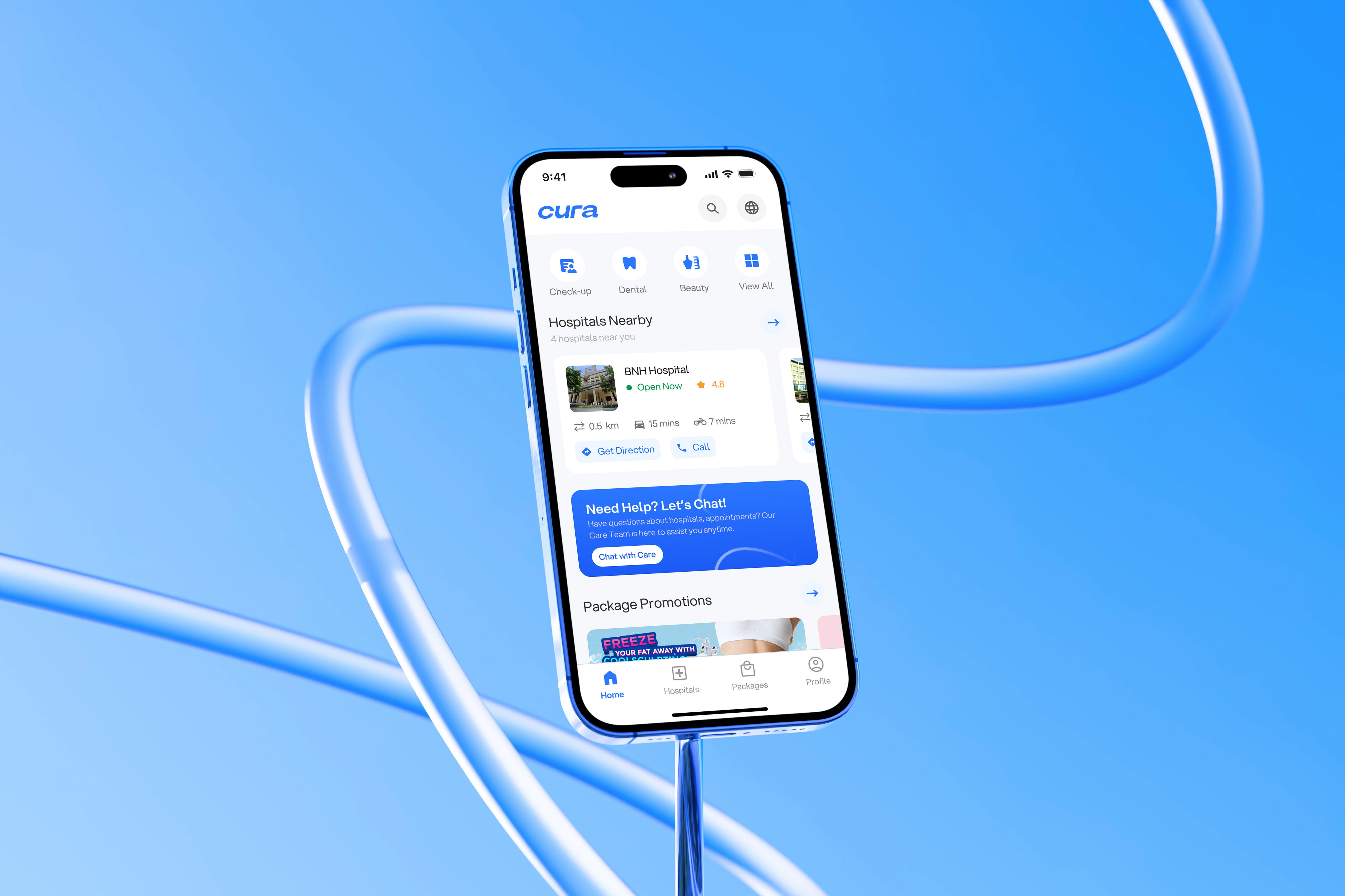
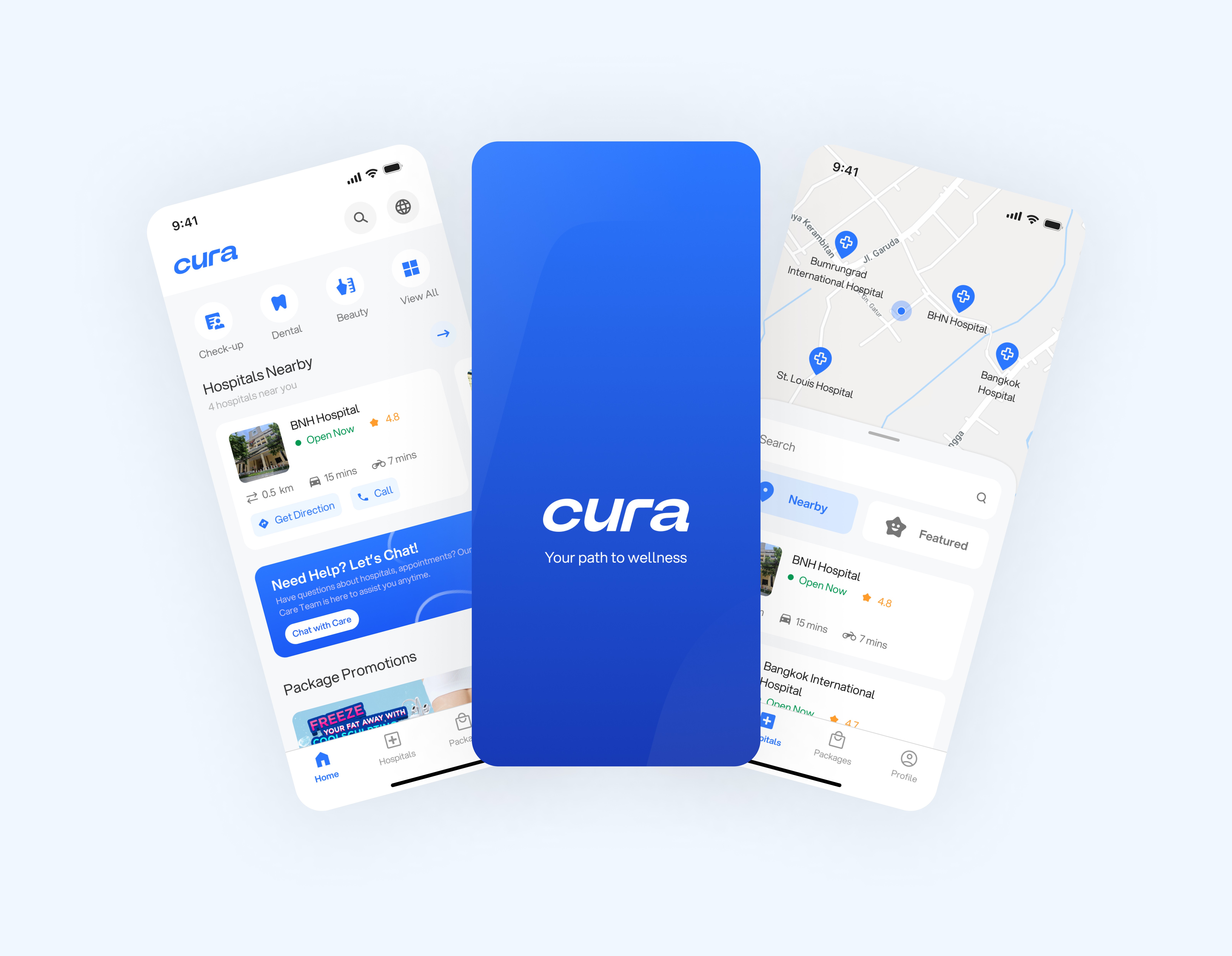
Empowering Foreigners with Seamless Healthcare Access in Thailand.
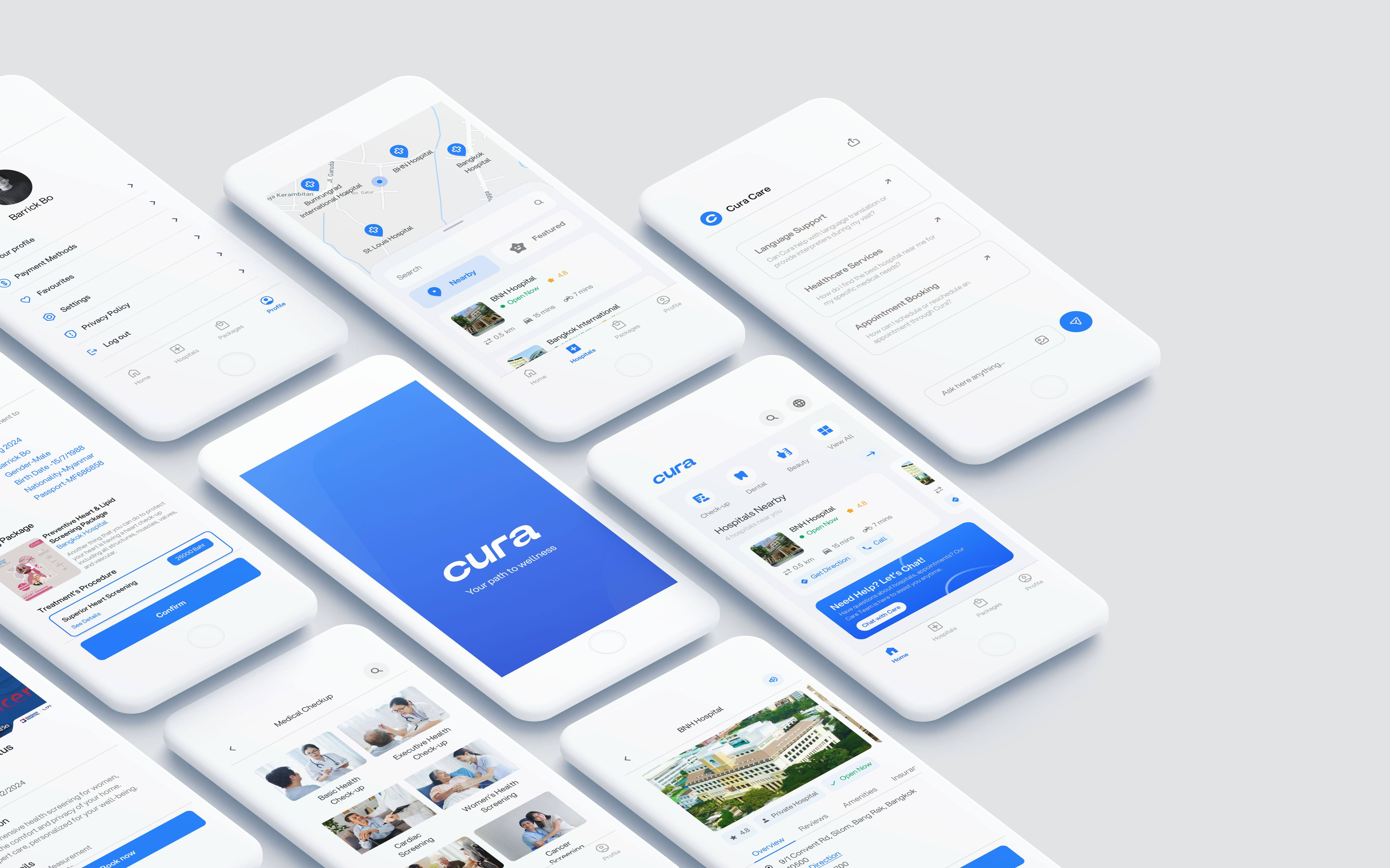
Navigating healthcare as an international patient can be overwhelming, especially when language barriers, unclear information, and inefficient systems come into play. This was the challenge faced by many travelers seeking medical care in Thailand. Cura Medical App was created to simplify the healthcare journey for these international patients. By providing a seamless platform for appointment scheduling, multi-language support, hospital navigation, and insurance integration, Cura bridges the gap between international patients and Thai healthcare providers.
Role
Team Lead UX/UI Designer
Skills
Figma, Adobe CC, Figjam, Trello, Miro, Jira
Collaboration
Project Manager, UX Researcher, Junior UX/UI Designer, Stakeholders
A Personal Journey to Simplify Healthcare for Foreigners
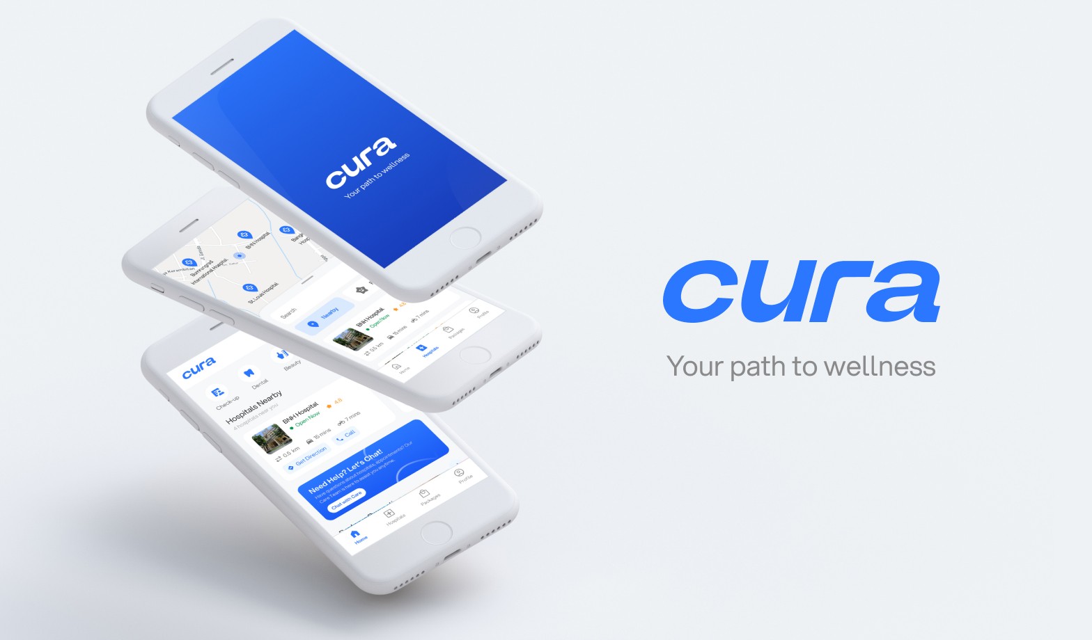
Living in Thailand as an foreigner was an exciting adventure, but when it came to healthcare, I found myself struggling in ways I never expected. Between the language barriers, finding trustworthy hospitals and navigating the confusing booking processes, healthcare felt like a maze I couldn’t escape. On top of that, the challenge of locating reliable care at famous, often expensive hospitals added another layer of frustration. That’s when it hit me: If I’m facing these issues, then so are so many others. And that's how Cura was born, an app designed to make healthcare easier, more transparent, and accessible for international patients like me, living abroad and seeking the care they need without the frustration.
Understanding the Problem : The Hidden Struggles of Foreigners
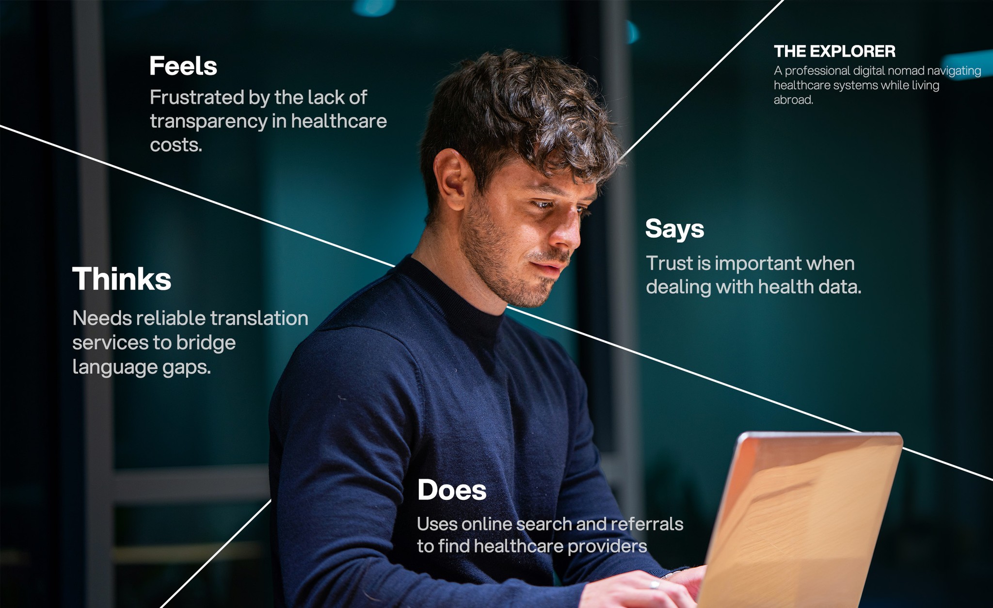
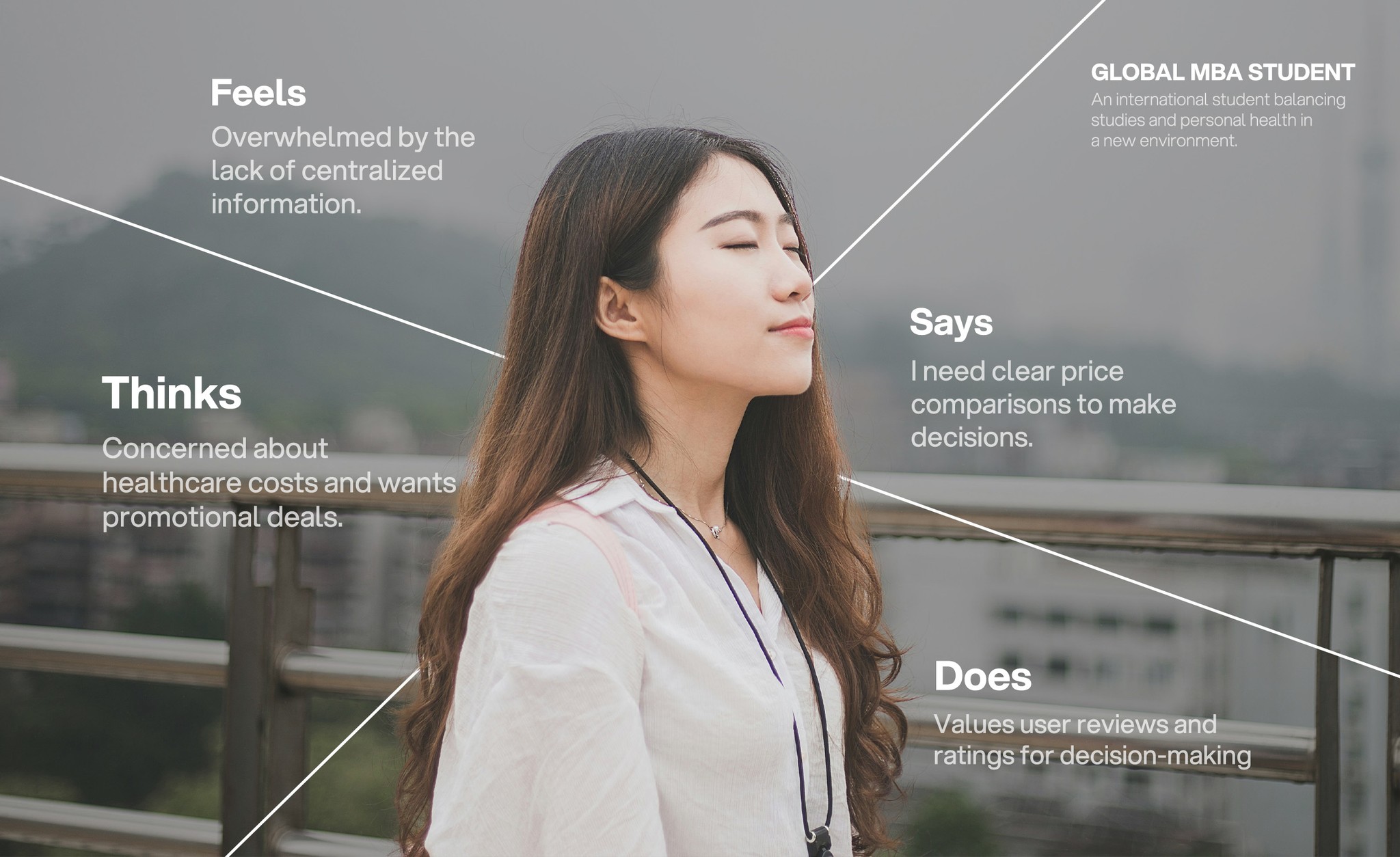
When we started talking to other foreigners, we realized just how widespread the problem was. Many shared their own stories of frustration:
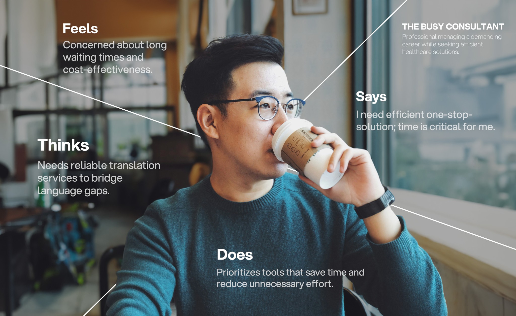
Language Barriers: Some couldn’t find a doctor who spoke their language, making appointments feel intimidating and isolating.
Confusing Navigation: The whole process of finding a hospital, booking an appointment, understanding costs was complex and often unclear.
Lack of Trust: It was hard to know which hospitals were reputable, which doctors were right for their needs, or even which ones accepted their insurance.
It became clear that healthcare for foreigners wasn’t just a series of inconvenient hurdles; it was an emotional journey. People needed more than just a service; they needed trust, guidance, and clarity.
How might we empower international patients in Thailand to navigate the healthcare system with ease and simplifying the entire process from booking to care?
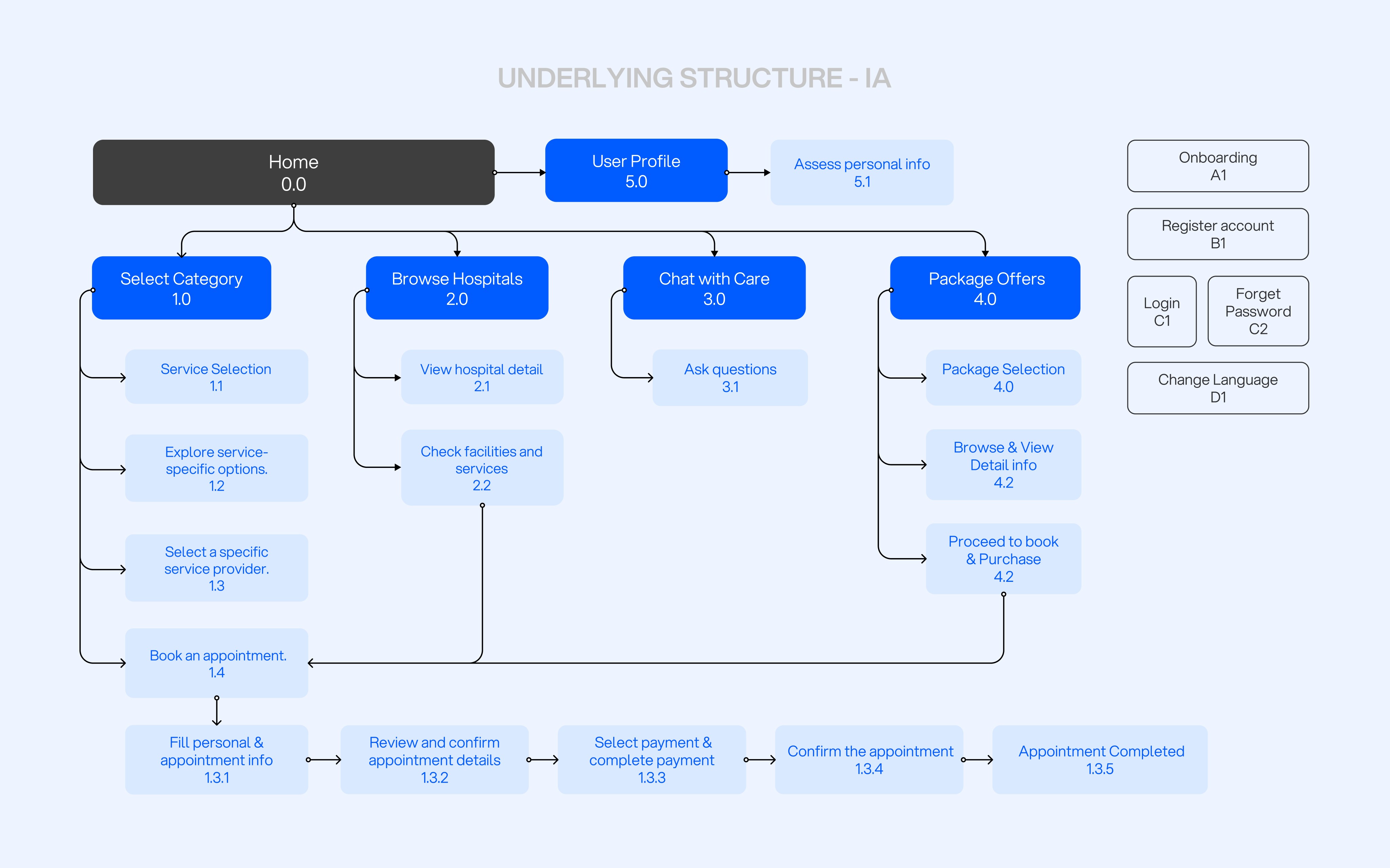
The Design Process : Building a Human-Centered Solution
Designing Cura wasn’t just about functionality and it was about empathy. We began by immersing ourselves in the needs of international patients, learning about their pain points, and envisioning how an app could truly serve them. We didn’t want to just create another app. We wanted to create a lifeline for people who were lost in the maze of healthcare in a foreign country. Every feature was designed with the goal of making users feel supported, heard, and understood.
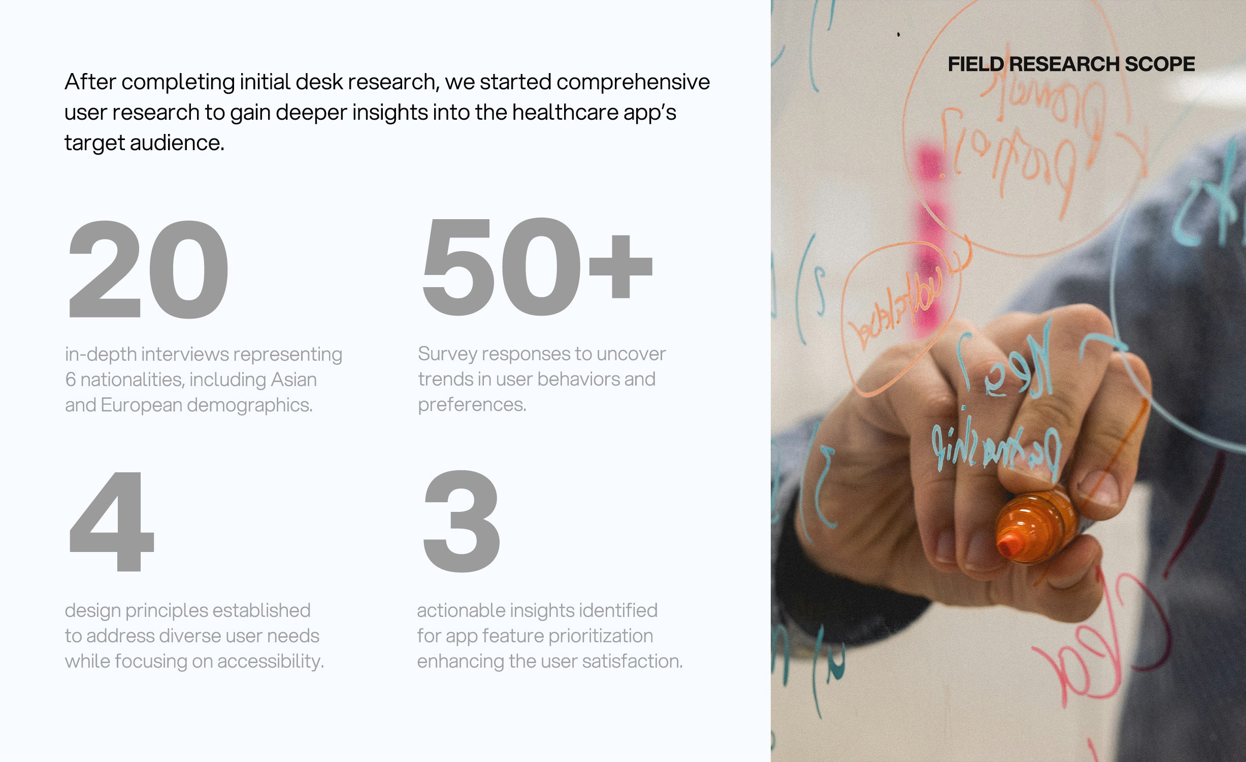
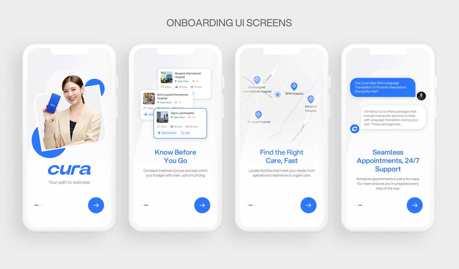
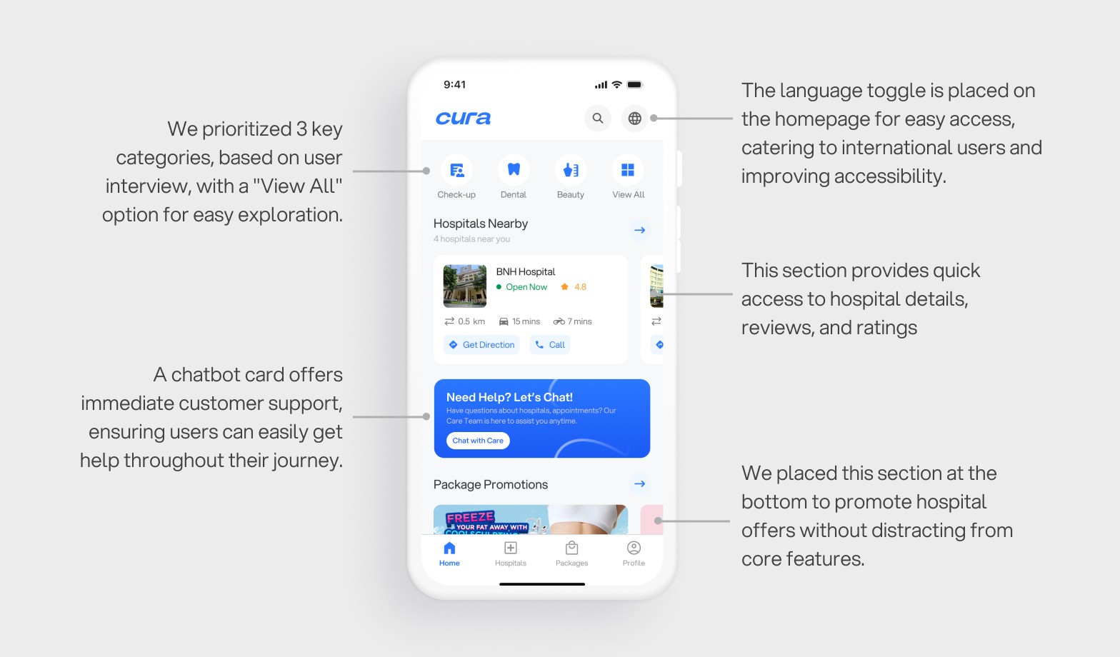
For Research & Insights, we started with desk research and deep user research. We conducted interviews with around 20 foreigners and analyzed existing healthcare apps, diving into what users were saying about their experiences. A recurring theme was the need for clarity and guidance. People didn’t just want a list of hospitals—they wanted a reliable, intuitive way to navigate the healthcare system. They needed information they could trust and personalized support to help them confidently book appointments and receive care without confusion.

Biggest Challenge: Bridging the Gap Between Technology and Humanity
The hardest part of this project was balancing the technical aspects with the human side of things. Healthcare is personal. People don’t just want to see a list of doctors or hospitals and they want to feel like someone is listening to them. So, while we worked on the technical design, we kept coming back to one question: How can we make people feel like Cura is more than just an app? How can we make it feel like a friend who’s there when you need them the most?
The "Aha!" Moment: A Simple, Seamless Experience
The breakthrough came when I realized that the key wasn’t adding more features or information , it was about creating a seamless experience. The more I thought about it, the more I understood that Cura needed to be the app that users could rely on, with clear, concise information, and the ability to easily book an appointment. It needed to simplify the entire healthcare process, so users could focus on their health, not the details of the system.
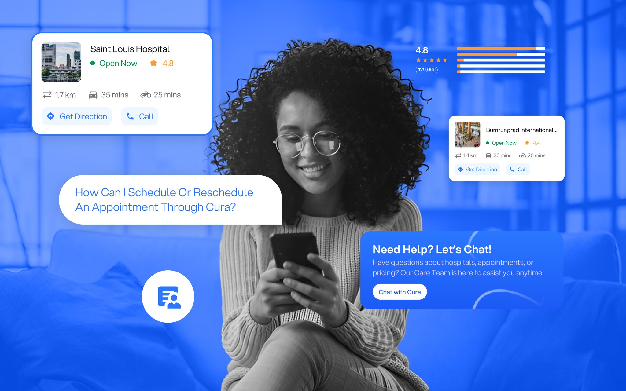
The turning point came when I realized that Cura needed to be more than just a healthcare app. It needed to be a companion for users, helping them through each step of their healthcare journey. This meant focusing on features that built trust and provided transparency like hospital reviews, language options, and seamless appointment booking.
Results and Reflections: Seeing the Impact
The feedback we’ve received so far has been incredibly rewarding. While the app is not officially live yet, the results from concept testing and usability study have been overwhelmingly positive. Foreigners have shared how Cura has transformed their healthcare experience in Thailand, empowering them to feel informed and supported. With the app, they can easily find the right hospital, book appointments, and navigate the complexities of insurance, all in one place. This feedback validates the impact we’re making and motivates us to continue improving and refining Cura as we move forward.
As the lead product designer, one of the most valuable lessons I learned was the importance of clear communication within the team. By prioritizing user insights and meticulously documenting every decision, we ensured that everyone stayed aligned and focused throughout the process.
If I Could Revisit One Aspect...
Looking back, if I could change one thing, I’d focus even more on personalization. While Cura is intuitive and helpful, I believe there’s room to make the experience even more tailored to each user’s specific healthcare needs. Imagine if the app could suggest healthcare options based on your personal health history or preferences, that would take the user experience to the next level.
Another key insight that emerged during user feedback was that many foreigners already have local friends who can support them with hospital visits or translation services, particularly for navigating the Thai healthcare system. This feedback led us to brainstorm ways to make the app more engaging, rather than just something users rely on when they’re sick or visiting a clinic. We began exploring ideas like adding regular health tips, tricks, and news updates like healthcare updates, mental health care advice tailored for international foreigners.
Measuring Success: Tracking What Matters
Setting UX benchmarks has been essential in tracking the app’s success. The real success of Cura isn’t just about downloads or ratings; it’s about how well it’s helping people. To measure this, we focused on a few key metrics that truly reflect user experience and satisfaction:
Satisfaction Rates: Our goal is to maintain at least an 85% satisfaction rate based on feedback, ensuring users feel supported and confident in their healthcare journey.
Task Completion: We aimed for a 90% task completion rate, ensuring users can easily book appointments or find a hospital without frustration.
Engagement and Usability: Instead of solely focusing on user retention, we also track how frequently users interact with the app, whether they are exploring features like appointment scheduling, hospital reviews, or accessing healthcare news.
Appointment Scheduling Efficiency: Monitoring how much faster hospitals are able to schedule and manage patient appointments using the app’s real-time availability feature.
These metrics, both from the user and hospital sides, provide us with a holistic view of Cura’s impact. By continuously refining the app based on these insights, we ensure that we are not only improving the user experience but also making the healthcare process more efficient and accessible for both patients and hospitals.
Key Learnings
The most important lesson I learned throughout this process is that empathy is at the core of every great design. Cura isn’t just a healthcare app; it’s a companion for those navigating a vulnerable experience. By prioritizing the user’s needs, I created something that feels human and goes beyond just technology. Other Key Takeaways are :
🔍 Know Your Why for Every Design Decision: Understanding the rationale behind each decision ensures alignment with both user experience and business goals.
💡 Impactful Products Address Hidden Challenges: Great products often solve unforeseen problems. By diving deeper into user feedback, we identified needs that reshaped our approach, making the product more impactful.
📈 The Importance of a Business Mindset: Aligning with business goals is as important as user-centered design. Understanding market needs and KPIs ensures the product is both valuable and sustainable.
📝 Documentation and Design Principles Are Key to Alignment: Clear documentation and design principles keep the team aligned, minimize misunderstandings, and ensure smoother execution.
These insights helped shape Cura into a product that not only addresses real user needs but also highlights the importance of a balanced, empathetic, and business-oriented approach to design.