Enhancing User Engagement and User Retention for Fintech in Myanmar
For over 30 years, Yoma Bank has built a strong reputation as one of Myanmar’s most trusted financial institutions. Beyond competitive interest rates and banking services, what truly kept customers loyal was their deep trust in the brand and its commitment to putting users first. This UX research case study explores how we tackled the challenges and made the banking experience more engaging, intuitive, and rewarding for Yoma Bank customers.
Role
UX/UI & Multimedia Designer
Skills
Sketch, Figma, Adobe CC, Figjam
Collaboration
Product Owner, Senior Product Designers, Business Analysts, Customer Research & Insight Team, Developers
Project Background
When I joined Yoma Bank’s UI/UX team, the new mobile banking app called Next App (MVP_Version) was already in progress. However, due to limited resources and Covid-19 pandemic at that time, the focus had been on launching a functional version first, leaving several UX debts that needed to be addressed. At this point, two major challenges emerged:
Migrating users from the old mobile banking app while ensuring they saw value in the new experience.
Attracting new users by making the app more engaging and rewarding.
I was responsible for conducting user research, usability studies and proposing design solutions that would enhance the overall user experience and improve adoption rates.
Product Promo Animation Video Created by Me
Listening to Users : Uncovering the Gaps in Digital Banking
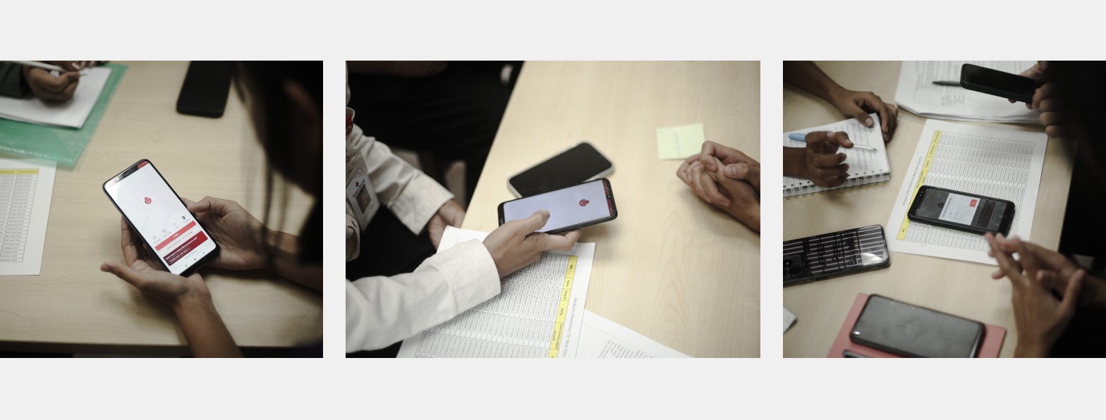
To better understand our users, our team of 8 UX and CX researchers visited multiple Yoma Bank branches and interviewed 50 real customers across diverse demographics. Through Qualitative + Quantitative Research and Behavior Analysis, we uncovered several key insights as below :
User Resistance to Change – Many existing users felt comfortable with the old app and saw no strong reason to migrate to the new one.
Security & Trust Concerns – Some users preferred visiting bank branches because they felt safer letting tellers handle transactions.
Feature Awareness Gap – Users did not fully understand some of the app’s core features, leading them to frequently call customer support, which overloaded the team.
Customer Support Overload – After identifying the third issue, we also interviewed customer support team confirmed that they were sometimes often overwhelmed with repetitive inquiries from users who didn’t know how to navigate the app.
These findings became the foundation for our opportunity areas and design solutions.
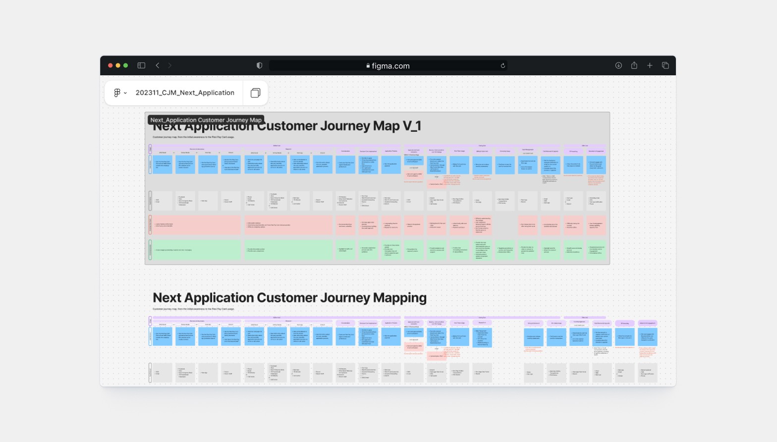
After synthesizing all the data and presenting our findings to stakeholders, it became clear that simply migrating users to the new app wouldn’t be enough and we needed to deeply understand their emotions, frustrations, and motivations throughout their digital banking journey.
To achieve this, we created a comprehensive Customer Journey Map that visualized the end-to-end experience of a Yoma Bank customer. This allowed us to pinpoint emotional highs and lows, highlight critical touchpoints, and identify where users encountered friction. By mapping out their journey from discovering the app to completing transactions we could anticipate pain points and design solutions that would feel intuitive and reassuring.
Opportunities & Design Solutions : Turning Insights into Action
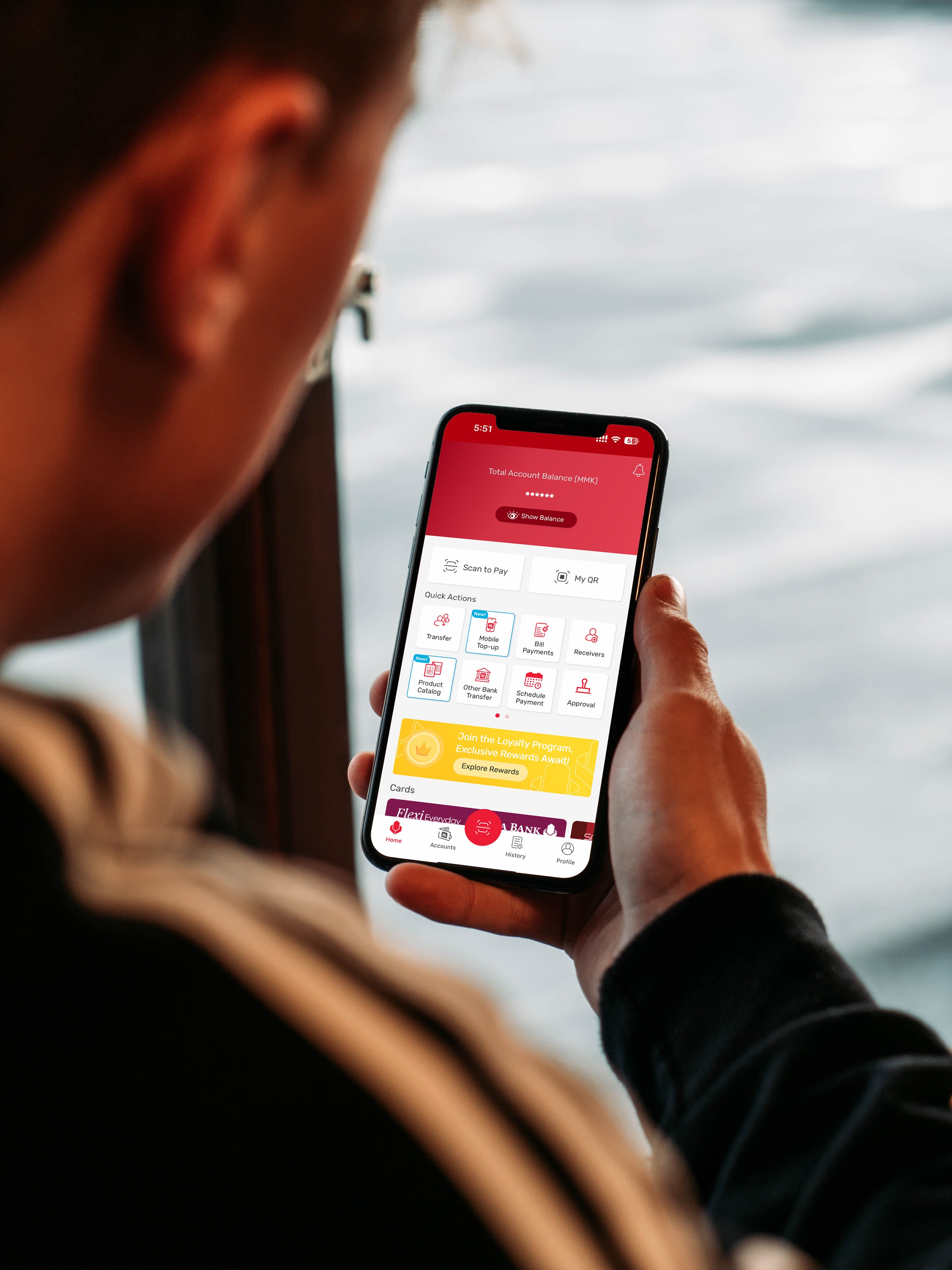
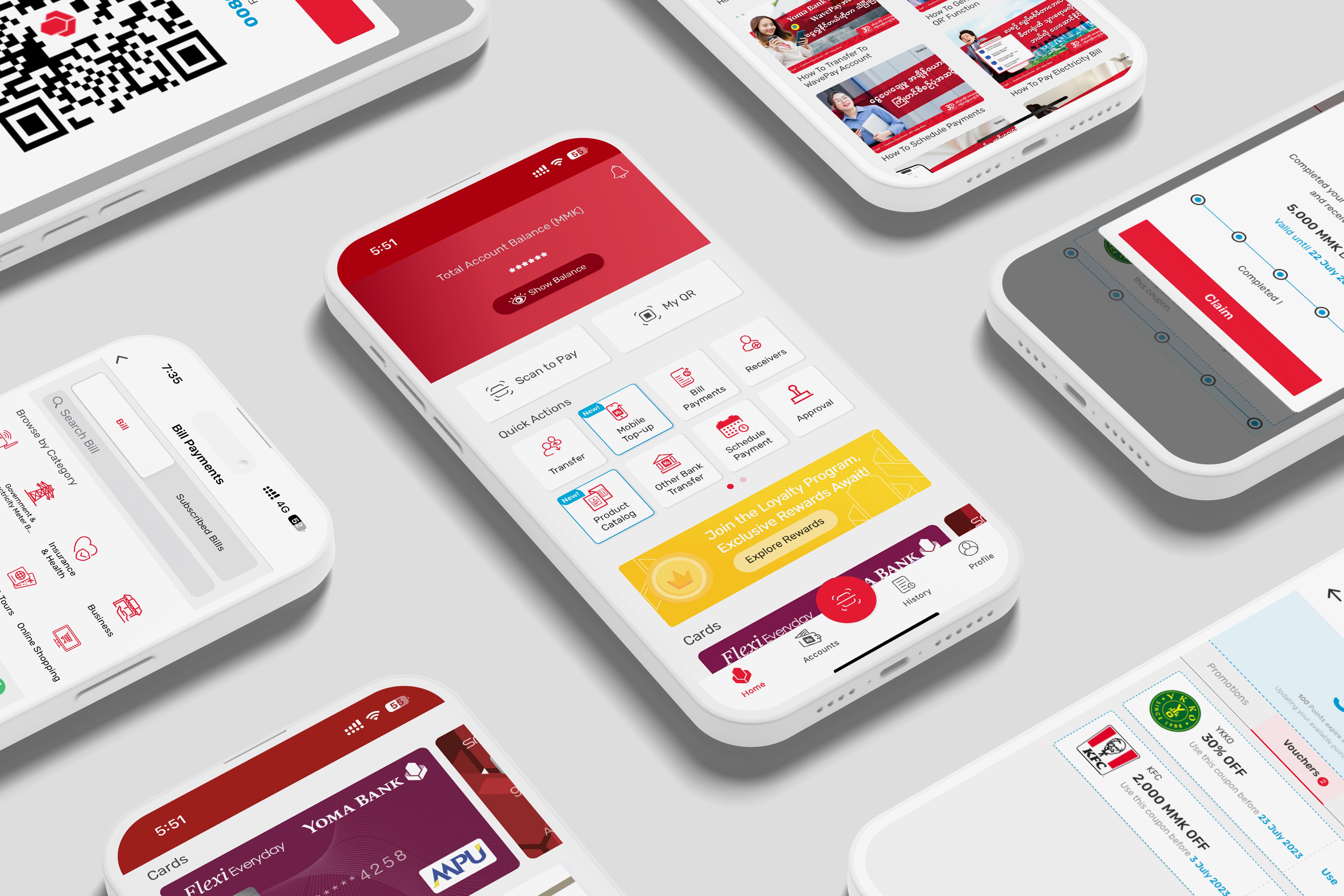
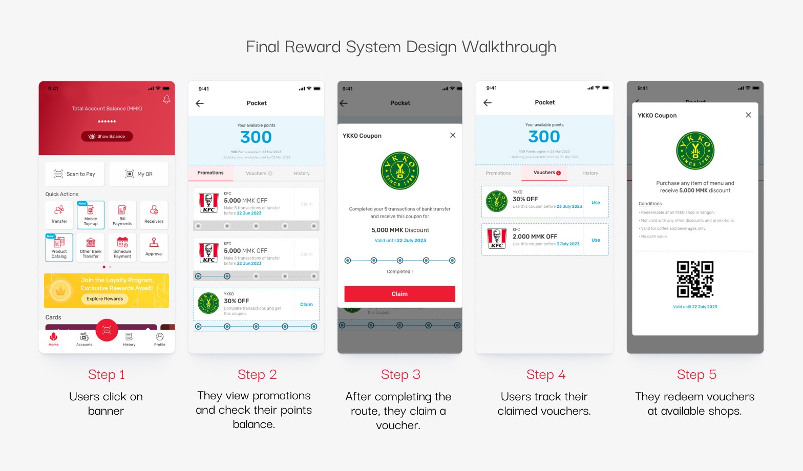
Solution 1 : Enhancing User Engagement with a Customer Reward System
One of the biggest challenges we identified was user resistance to change—many long-time customers were comfortable with the old banking app and saw no compelling reason to switch. To address this, we introduced a Customer Reward System, designed to incentivize app usage and long-term engagement.
The reward system allowed users to earn points based on their interactions within the app, such as making transactions, referring friends, or completing specific actions. These points could then be redeemed for benefits, including discounts, vouchers, or exclusive banking perks. By integrating this system, we not only encouraged customers to explore the new app but also reinforced their loyalty to Yoma Bank.
Solution 2 : Bridging the Gap Between Digital and Traditional Banking
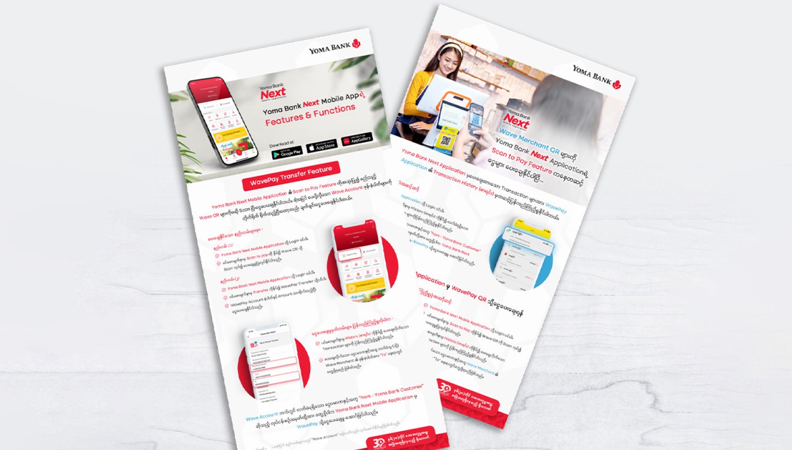
Through our research, we discovered that some users preferred visiting physical branches because they felt more secure when tellers handled their transactions. This behavior was a significant barrier to digital adoption. To ease this transition, we collaborated with the Marketing Team to create in-app educational content that would gradually introduce users to key app features while reassuring them about security measures.
We designed in-app banners, one-pager guides, and product promotions to help these customers understand the benefits of digital banking. Additionally, we introduced targeted pop-ups for first-time users, guiding them step-by-step through essential actions such as fund transfers, bill payments, and account management. This initiative helped build confidence among hesitant users, making them more comfortable using the app.

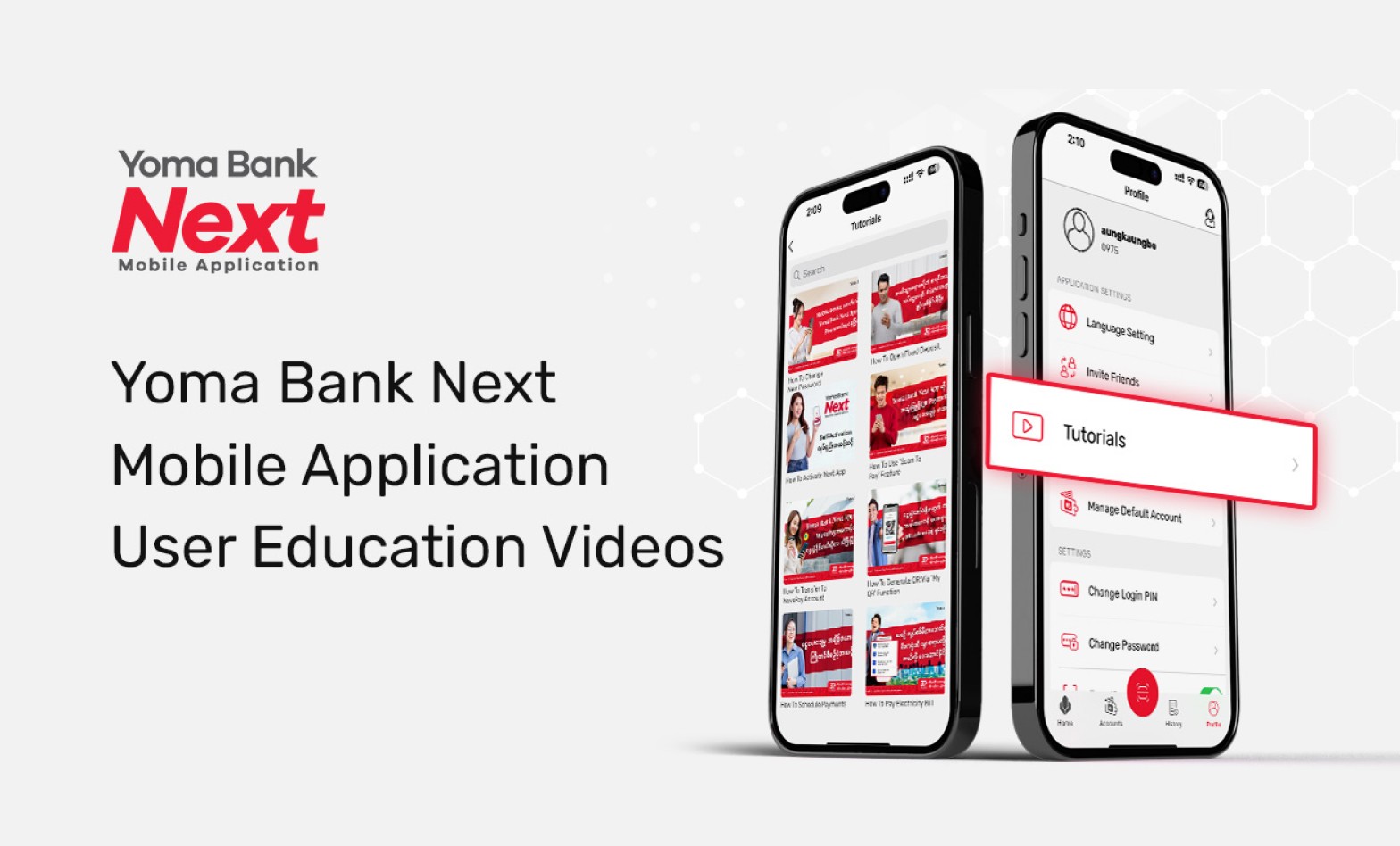
Solution 3 : Empowering Users Through an Educational Video Series
Another major issue was that users struggled to understand certain features, leading to an overwhelming number of customer support calls. Instead of relying solely on written guides, we recognized the need for a more visual and interactive approach. Leveraging my skills in animation and video production, I created a comprehensive educational video series, breaking down app functionalities into bite-sized, easy-to-follow tutorials. These videos were embedded directly within the app, allowing users to access help exactly when they needed it. Additionally, we uploaded the series to YouTube, making it accessible to a broader audience.
This initiative significantly reduced the burden on customer support teams, as users could now self-learn and navigate the app independently. The videos not only improved feature adoption but also reinforced Yoma Bank’s commitment to user-friendly, customer-first digital banking.
Here is Educational Videos Playlist : Click Here
Results & Impacts : How users responded to the new experience
Our solutions were implemented, and then three months later, we saw tangible improvements in user engagement:
📌 25% Growth in New Users – The improved user experience led to a higher rate of new customer acquisitions through the app.
📌 60% Increase in Daily Active Users – More users engaged with the app consistently, driving sustained growth over three months.
📌 Customer Support Calls Reduced – After launching the in-app tutorial videos & YouTube series, we saw a significant drop in calls related to app navigation and feature usage.
📌 User Feedback Improved – Many users started praising Yoma Bank’s Next Baning App for being more user-centric and intuitive.
📌 Increased Feature Adoption – More users began engaging with the app’s full range of features, rather than relying solely on branch visits.

Learnings & Reflections
Working in the Yoma Bank UI/UX team was both a challenging and enriching experience. It pushed me to grow as a designer while balancing user needs, business objectives, and technical constraints. Here are a few key takeaways from the project:
🎯 User research requires creative adaptation - Researching banking customers in a highly traditional market taught me how to blend qualitative insights with data to drive decisions. Even small user samples can lead to powerful insights when approached thoughtfully.
⚙️ Complex systems need intuitive solutions - Banking apps can feel overwhelming, especially to users transitioning from traditional banking methods. Designing a reward system and educational support within this environment taught me how to create simple, integrated solutions that align with both business goals and user expectations.
🤝 Collaboration drives innovation - This project emphasized the value of early and consistent communication with developers, Product Managers, and stakeholders. By involving everyone in ideation and iteration, we achieved a shared vision within tight timelines.